I have the privilege of working for a company which only produces accessible applications but I would like this ethic to rub off on some of my personal projects.
In the next series of posts, I'm going to make my blog accessible and explain how I did it and what tools I used to do it hopefully giving insights for others into a how to make their applications accessible. In order to do this I will be making this site WCAG 2.0 compliant.
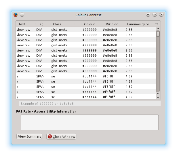
 The first step in this process is to tweak the colour scheme of the site in order to be WCAG compliant. Which is to say, having a greater than 4.5 contrast between all text and it's respect background and make sure the link colour has a greater than 3.0 contrast with the surrounding text.
In order to find the issues with the site I used a firefox plugin, luckily once the issues were found it wasn't much work to fix them and the blog's theme by default was mostly accessible as only two pieces of text had to be changed to a darker colour. The main issue was the github gist iframe I use to display code snippets, unfortunately this had several issues with the area surrounding the code surface. In order to fix these issues, I hid the bottom bar and added CSS to darken the line numbers on the side. I'll have to add an attribution to github somewhere else in the site.
There you have it a small change which will help a certain demographic of visually impaired users to use my site more effectively. In my next post I'll be discussing keyboard usability.
No comments:
Post a Comment